In the competitive world of dog adoption, what makes one organization stand out from the pack?
Westside German Shepherd Rescue is a nonprofit, no-kill adoption center in Los Angeles. As a dog lover I was more than excited to work with this client. Jumping into the initial research phase, however, it became clear that no number of cute puppy photos could distract from the amount of work this website needed in order to reach its full UX potential.
Background
Westside German Shepherd Rescue is a Los Angeles-based nonprofit no-kill rescue center committed to saving German shepherds from high kill shelters and finding them loving homes. Despite having a great reputation within the community, the center was having trouble attracting potential adopters. This sprint was dedicated to understanding the needs of potential adopters, identifying relevant issues with WGSR’s current online positioning, and designing and testing an MVP prototype for web and mobile based on these findings.
Timeline
Duration: 2 weeks
Deliverables: Scalable desktop and mobile website prototype
Research
Task Analysis, Competitive & Comparative Analysis, Heuristic Evaluation, User Interviews, User Survey, Persona, Information Architecture
It takes a certain kind of person to adopt a German shepherd
An initial round of research and synthesis narrowed the scope of this project by identifying key traits, motivations, and concerns of users most likely to interact with WGSR’s site. This data informed the creation of a persona, the Apprehensive Adopter, which served as a guiding principle for the rest of this design sprint.
Tell me everything I want to hear
The Apprehensive Adopter is interested in bringing a new dog into their home. They’re open to the idea of adoption versus sourcing from a breeder, but they have several reservations. How can they find all the information they need to feel secure in choosing the adoption route—let alone one center over another? How can they be sure that information is trustworthy? And how can they be sure bringing a German shepherd—one of the world’s most notoriously aggressive dog breeds—into their home is a good idea?
Defining the problem
The Apprehensive Adopter has trouble building confidence in an adoption center whose online presence makes it very difficult to make a well-informed commitment to its services. A disorganized and confusing information architecture buries some of the most important facts about the center’s principles and methods in hard-to-find places. And despite coming into the process with specific preferences and needs, the site does not have any filtering or sorting functionality, making the search for relevant information a chore.
Original Sitemap: Let’s call it “vertically-challenged”
Making the site work for the user—however they want to access it
Giving the site a more minimalist aesthetic and logical architecture should make it simple enough for even the most skeptical user to find the information they need in order to develop trust for WGSR and move forward with the adoption process.
The ability to filter dogs by research-identified key criteria should make it easy to sort through the center’s large inventory.
More information provided about each dog, including history and personality details, should allow users to feel enough affinity for one or more potential-adoptables to fill out an application.
Creating a fully-responsive site should retain more users, as research data indicates that many Apprehensive Adopters use their phones more frequently than the computer to browse the internet.
Digging In
Exploring the existing website while working on my project plan, I began to get a feeling for the types of research needed in order to gain a clear understanding of how WGSR’s product could be improved. A standard heuristic evaluation and competitive/comparative analysis were definitely in order; I also decided to conduct a user survey and interviews to better understand people’s motivations and perceived pain-points regarding pet adoption, online research, and German Shepherds as a breed.
Heuristics? What heuristics?
The heuristic analysis revealed a laundry list of violations, primarily centered on the site’s lack of a minimalist design aesthetic. The site also seldom adheres to industry-standard design conventions, particularly when it comes to navigation and button placement. Links to important site functions are buried far down on multiple pages, forcing the user to recall their precise location as opposed to easily recognizing how to get where they want to go. And bad links leading to error messages or the wrong page abound, creating issues with both user control and system status visibility.
Get in, Apprehensive Adopter—we’re going shopping
My competitive analysis focused on other nonprofit organizations in the pet adoption space, including the San Francisco SPCA, Marin Humane Society, and Dogs without Borders. The former two sites, in particular, provided key insight into more logical content structure for an adoption site, as well as a cleaner, more minimal aesthetic overall. They also made it simple to sort through adoptables with filtering and sorting functions, and the all-important ability to donate was always a click away.
For comparative analysis I focused on more popular pet-related sites including the American Kennel Club and Petco. The insights I gleaned from examining Petco’s structure led me to investigate other e-commerce sites such as Amazon, with the idea that browsing for a dog online could share a lot of the familiar functionality of the online shopping experience.
Asking the right questions
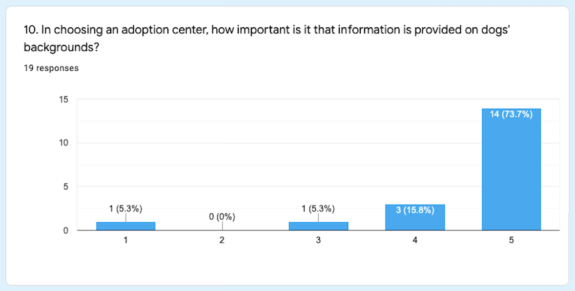
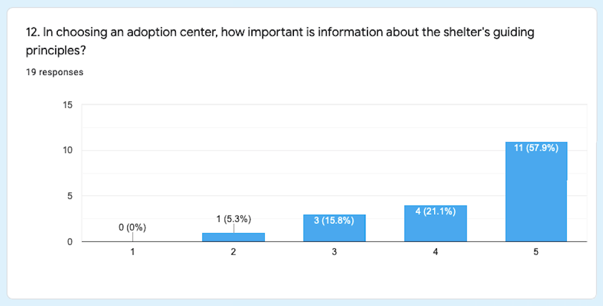
This survey was taken by 25 participants. While it provided me with some helpful demographic information and important insights about adoption preferences, it became clear I needed to obtain more in-depth information on certain topics in order to better understand my user and construct an accurate persona.
I interviewed eight users for this project, enabling me to fill in a lot of the information gaps identified by my survey results. In particular, I made discoveries about users’ common reservations about adoption, their specific feelings about German Shepherds, the types of information they’d need in order to feel comfortable proceeding with an adoption, and their internet usage habits.
I then synthesized information from the survey and interviews with an affinity map. Once we were able to distill this broad range of data into some key points, our persona, the Apprehensive Adopter, announced itself to us quite readily.


Glowing up…and up
An analysis of the site’s information architecture based on our persona’s needs made it easy to reorganize into a helpful, more vertically-oriented structure that put the user first.
Bringing it to life
The following Figma prototype was the culmination of all my initial research. As an MVP this responsive prototype focused on key functions of the mobile web flow, as well as key desktop screens to demonstrate layout changes beyond the breakpoint.
The real test
User testing my design solutions with eight new subjects put my initial hypothesis on trial, and I was happy to note a drastic increase in overall satisfaction and ease of navigation. Nearing the end of my two-week design sprint, I took note of key takeaways from this research on which to iterate in a subsequent sprint:
Almost all non-positive feedback was regarding the application form. While I attempted to give the form a design overhaul in this sprint, my intention was to simply reorganize, rather than edit, the form’s contents. My next iteration would include an audit and reconsideration of the form content with an interest in eliminating unnecessary requests.
There was also a concern about the mobile-friendliness of some of the filtering features I implemented, e.g. checkboxes, which I would want to replace in further iterations.


